Dashboards for Nerds: DataFrame Plotting in Databricks
I don't like BI tools. I use Databricks AI/BI, and I stopped using Power BI and Qlik a long time ago. However, I always feel like something is missing. One option could be to create dashboards from charts generated by Matplotlib and pandas. However, since I'm not a fan of pandas, I usually give up on that approach.
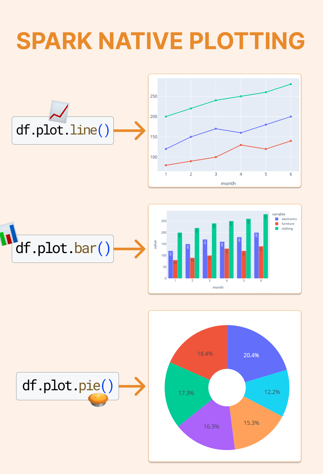
Now, finally, there is something for me: Spark native plotting. I no longer need to convert a dataframe to a pandas object. Under the hood, it uses pandas and plotly, but I don't see it and avoid cumbersome steps, so I can use it directly on a dataframe.
df.plot(kind=”line”, x="category", y="int_val")
Before we see some nice examples, let's consider what's next. I'd like to have the option to add charts generated by this code to a Databricks AI/BI dashboard, which can create the best dashboard for data nerds in the entire world.
Let's see how it works on this dataframe:
data = [
    (1, 120,  80, 200),
    (2, 150,  90, 220),
    (3, 170, 100, 240),
    (4, 160, 130, 250),
    (5, 180, 120, 260),
    (6, 200, 140, 280),
]
cols = ["month", "electronics", "furniture", "clothing"]
df = spark.createDataFrame(data, cols)
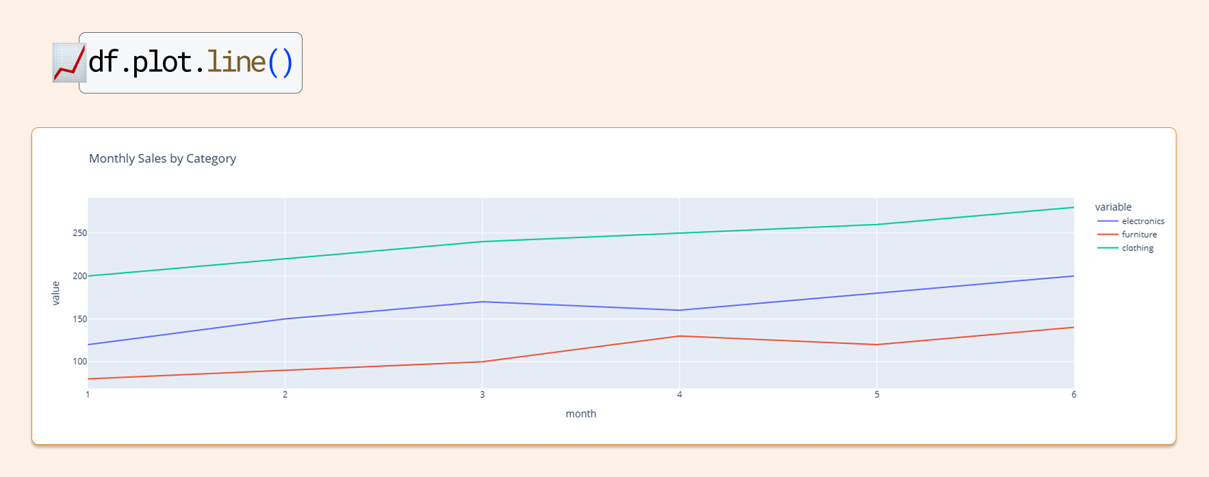
Line Chart: monthly trend by category
# ────────────────────────────────────────────────────────────────────────────────
# Line chart – monthly trend by category
# ────────────────────────────────────────────────────────────────────────────────
df.plot.line(
    x="month",
    y=["electronics", "furniture", "clothing"],
    title="Monthly Sales by Category"
)
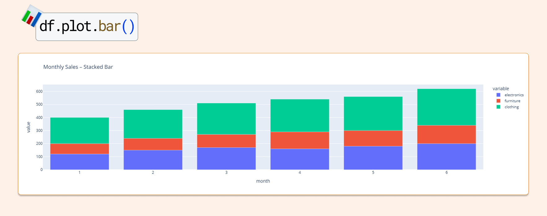
Bar Chart: same data in bar form
# ────────────────────────────────────────────────────────────────────────────────
# Stacked bar chart – same data in bar form
# ────────────────────────────────────────────────────────────────────────────────
df.plot.bar(
    x="month",
    y=["electronics", "furniture", "clothing"],
    title="Monthly Sales – Stacked Bar"
)
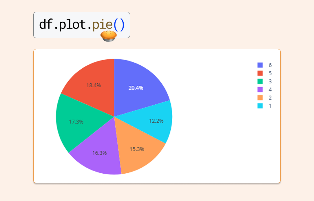
Pie Chart
# ────────────────────────────────────────────────────────────────────────────────
# Pie Lake :-)
# ────────────────────────────────────────────────────────────────────────────────
df.plot.pie(
    x="month",
    y="electronics",
    title="Pie Chart"
)
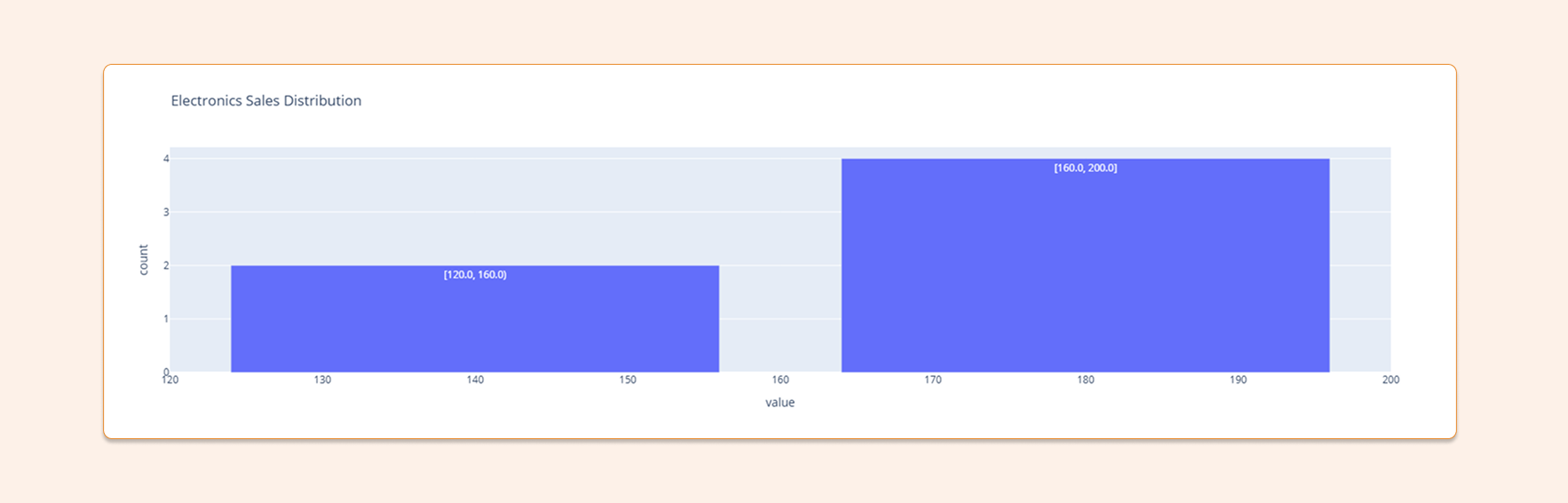
Histogram: distribution of electronics sales
# ────────────────────────────────────────────────────────────────────────────────
# Histogram – distribution of electronics sales
# ────────────────────────────────────────────────────────────────────────────────
df.select("electronics").plot(
    kind="hist",
    bins=2,
    title="Electronics Sales Distribution")
For more great charts and options, visit https://plotly.com/python/plotly-express/
Require runtime 17.0 at least.